YEAR:
2026
BRAND IDENTITY
KARKADE
CLIENT:
BEVERAGE BRAND · GIZA
IDENTITY · EDITORIAL · PACKAGING
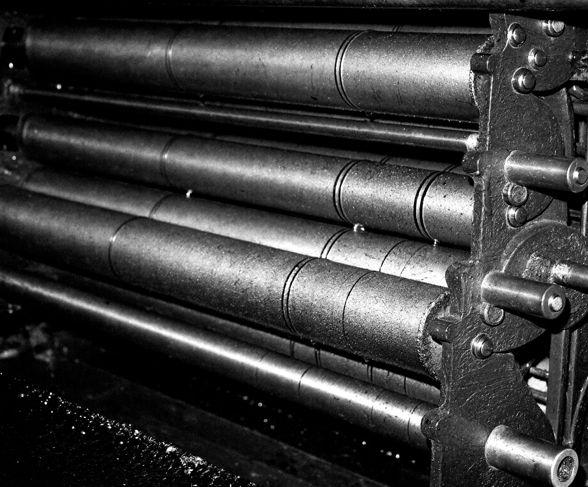
A beauty brand obsessed with structure. We took that obsession literally — every layout, every composition, every typographic decision governed by a single geometric principle that runs through the entire system.
challenge
A hibiscus drink competing on a shelf where everything shouts. The category defaults to red, gold and a photograph of the fruit. The client had the better product and the worse package, and the brief was to fix the second without adding cost to the first.
results
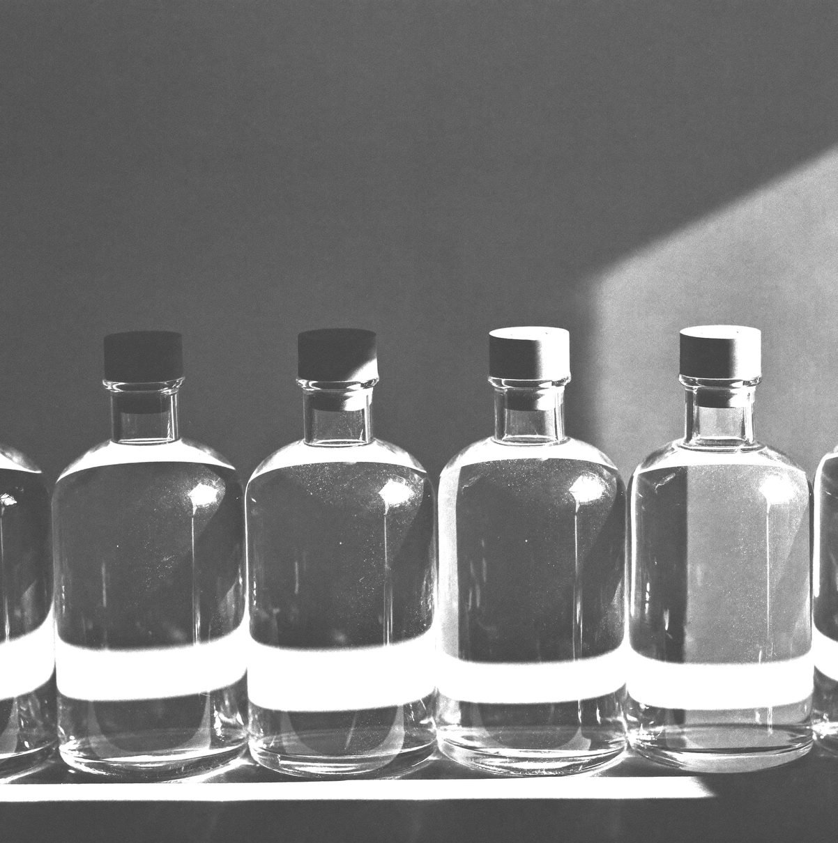
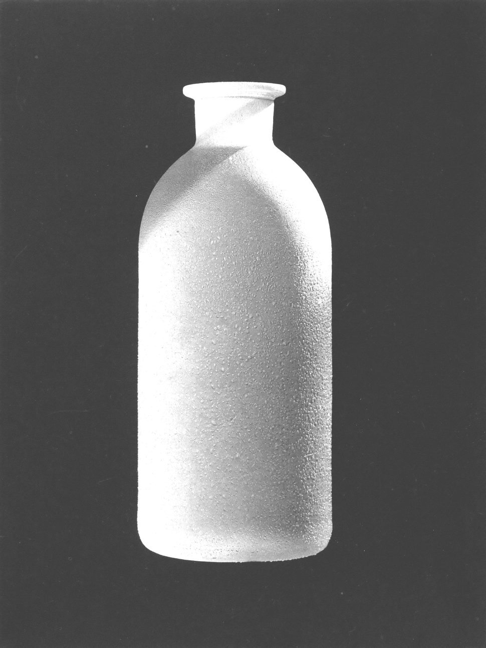
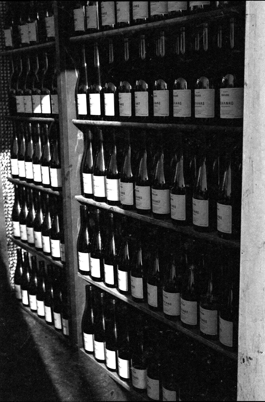
A packaging system built on Arabic lettering rather than imagery, printed in two colours to hold the unit cost. The same system carried into point of sale, market stalls and Ramadan gifting boxes. It now reads as one brand from three metres away, which is where the decision is actually made.
READY TO MAKE SOMETHING WORTH KEEPING?
ONE CONVERSATION CAN CHANGE EVERYTHING.
IF YOU KNOW, YOU KNOW. REACH OUT.